CASE STUDY / BRAND IDENTITY
Holy Hell is an American comfort food restaurant that spices up traditional dining with a playful, hell-themed twist. By mixing hellish motifs with mouthwatering comfort food through unique illustrations, I softened the brand’s gritty edge — pairing a simple, refined color palette with a distinctive illustration style.
ROLE
Art Direction
Illustration
Brand Identity


Illustration assets
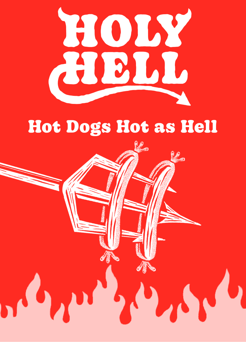
Holy Hell’s illustration assets lean straight into the brand’s playful, irreverent core, bold and a little edgy, on purpose. They’re built to repeat across the system: blow them up as hero images, or let them fall back into texture.”

Posters


Menu & landing page
That same energy carries straight through to the website. On the landing page, the illustrations lead: big, loud, unapologetic, the first thing you see. On the menu, they pull back (still bold, just quieter), working as accents and texture so the food stays the star without the brand going soft.


Menu


